Spatial Data Science
Podcast Interview: Debra Roberts on the True Meaning of Open Science
3 min
Lots of presentation, design, and publishing software allows you to quickly draw things like charts and maps. When you create a symbol with that software, say a pin on a map or a line on a data chart, you're typically given some default design, and then the option to change things like thickness and colour. Often people choose things they like, maybe a bright colour. Or they just go with the defaults.
Cartographers and information illustrators of various kinds have been researching symbols and how to make them effective for decades. We've carefully identified the many aspects of visual symbols that can be varied and connected to the meanings the symbol is meant to portray; these are called visual variables.
This figure illustrates some of the visual variables identified:

Virtually all drawing or graphics software packages give you options for selecting or changing some or all these things, or for varying them by values in the data. A simple example is how a bar chart uses symbol size (i.e., bar height or length) in proportion to some number in the data.
Other changes are more arbitrary, media-constrained, or "style" based, such as whether you're working in only greyscale because of printing restrictions, or you choose a particular shade of purple as a kind of branding or characterization.
But how do you choose these visual variables well? There are strong guidelines on this from Jacques Bertin (1918-2010), the French cartographer who first formalised the theory in 1967: the visual variables each have various perceptive properties, or kinds of difference the human mind tends to preattentively interpret in what it's seeing.
Major perceptive properties include:
Of course, when the brain thinks these things about the symbols it's seeing, we extend these thoughts to the symbol referents, that is, the "real" things the symbols represent. So, the symbols appearing ordered, for example, leads us to believe the data is ordered.
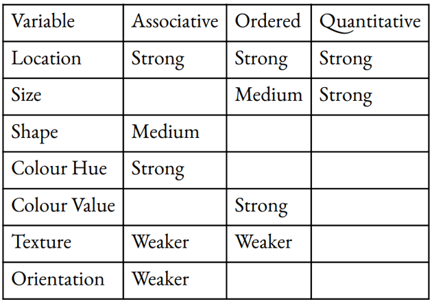
Here are the visual variables shown above with their relatively stronger and weaker perceptive properties, with blank cells where the perception is poor:

In light of our minds' strong tendencies to see certain perceptive properties in graphics, it makes sense to harness these automatic mental processes rather than work against them. So choosing symbols in your presentations, data charts, or maps is best done by thinking about the kinds of differences that exist in your data — whether groupings, sequences, or amounts — and choosing graphic variables according to how well they are associated with the perception of that kind of difference.
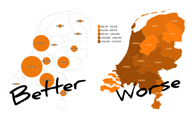
So, for example, if your data is of counts like the 2022 population of Dutch provinces (as reported by CBS), making symbols of varying size is generally a better choice for communicating the message than varying their colour value:

Location is a powerful visual variable (that's why scatter plots and line graphs work well), but if you're making a map, you typically can't use it very much because the symbol location is directly related to the geographical location of its referent — so the other visual variables become more important.
This just scratches the surface of the guidelines on how to choose your symbols when illustrating data! There are more graphic variables than those identified above (e.g., opacity, crispness, and more), there are differences between 2D and 3D graphics and their visual variables, and the variable-perception idea extends to interaction types in evolving digital interfaces and interactive data illustrations.
Login and start learning!